|
|
| Jack Kirby Collector celebrates the life and career of the "King" of comics through interviews with Kirby and his contemporaries, feature articles, and rare & unseen Kirby artwork. Now in tabloid format, the magazine showcases Kirby's art at even larger size. |
Grafitti On The Moon: Kirby Vs. KubrickA commentary on Jack Kirby's adaptation of 2001: A Space Odysseyby John P. Alexander I am almost as big a fan of Stanley Kubrick as I am of Jack Kirby. As a kid I spent many long hours drawing Kirby-derived comic books for fun. The Fantastic Four may be my all-time favorite comic, but 2001: A Space Odyssey is my all-time favorite film. I also filled canvases inspired by the promotional art from 2001 that had been painted by aerospace artist Robert McCall. Both of these artists, who were preeminent in their respective fields, had a profound influence on my aesthetic sense. I made McCall's acquaintance while preparing a science fiction film festival in college in 1976, and cherish several original artworks I received from him. I will forever regret never having met Jack Kirby. It is therefore ironic that I must play devil's advocate when it comes to the subject of Jack's comic book adaptation of Stanley Kubrick's milestone motion picture 2001: A Space Odyssey. If you have a problem with anything here, I suggest that you consult Jerome Agel's comprehensive book The Making of 2001. I have previously written in TJKC about "Kirbyizations" or Kirby versions of film or television source that appeared in Jack Kirby's comics over the years. In these, Jack would take an inspirational source and put his own spin on it. There were a number of occasions in which Jack got his hands on licensed authorized movie projects, where he could apply his talents directly to the original material rather than make his own second-generation versions. Strangely, these adaptations, like the 1979 newspaper strip version of Disney's The Black Hole, lack vitality and compare poorly with the source material. Like Ted Turner's "colorized" version of Casablanca, they hit the floor with a hollow thud. Unfortunately, Jack's authorized "comic book" version of the feature film 2001: A Space Odyssey belongs to this category. This book was peculiar for a number of reasons. For one, it was made eight years after the film's initial run and therefore cannot be considered a marketing tie-in. 2001 had not been in general release since the early 1970s when it was hyped as "The Ultimate Trip" to play up the "psychedelic" aspects of the final "Jupiter and Beyond the Infinite" sequence in the film in order to appeal to the "art house" crowd. It is hard to believe now, but for a few years, 2001 had the status of Rocky Horror Picture Show with midnight shows playing to stoned college students. Fantasia with its magic mushrooms was also re-released in the mid-1970s with this market in mind. 1976 was a full year before the release of Star Wars, and the advent of a self-perpetuating film/product tie-in market with endless paperbacks and action figures! With this one-shot book and the short-lived 2001 series which followed, Jack was toying with a marketing concept several years ahead of its time. The oversized format of the 2001 book, popular with Marvel during this period,
did not enhance Kirby's artwork because it was printed at close to a 1-to-1
ratio with his original renderings. Kirby's style had become looser in
later years and photographic reduction was "tightening" his art, doing
to it what a truss does for a hernia. My real regret about the Kirby 2001 book,
is that MGM didn't authorize it back in 1968 when Jack was at the zenith
of his artistic powers. The result might have been truly awesome. The 2001 book
displays a panoply of artistic laziness on Kirby's part. For instance,
Jack made no attempt to draw the faces of Keir Dullea, Gary Lockwood, or other
cast members. Instead, we see a set of interchangeable Kirby stock faces. One
need only look at the October 1968 Mad magazine parody "201 Minutes of
a Space Idiocy" to see how superbly Mort Drucker caricatured the actors'
faces. The actors had probably signed standard contracts allowing their likenesses
to be used in promotional materials, so there was probably no legal impediment.
A notable exception to this practice was Richard Dreyfuss' refusal to sign
such a contract for Close Encounters of the Third Kind. As a result, his likeness
appeared on none of the licensed merchandise for CE3K like the collector card
set. As much of 2001 is wordless, Kirby's addition of banal and often ludicrous
dialogue like "Space traveling will never soften up that jogging nut!"(pg.
35), not only fails to enhance the story, it is as inappropriate as
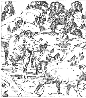
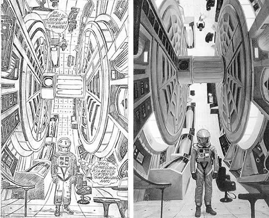
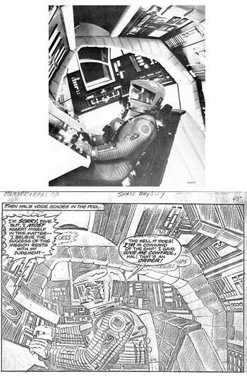
Jack took liberties with the final cut I believe to be all his own. Kubrick actually filmed scenes which did not make the first cut. These include a schoolroom scene at the Clavius moon base in which Kubrick's own daughter appeared in the cast, and the purchase of a bushbaby in a futuristic department store for Heywood Floyd's little girl who appeared in the video phone scene (also played by another of Kubrick's daughters)! Kirby used none of this material and was apparently unaware of its existence! Arthur C. Clarke's non-fiction memoir The Lost Worlds of 2001 recounts a number of versions that did not make it to celluloid, but none of this appears in the Kirby book. It is clear that Jack read Clarke's original novel, for in a couple of instances Kirby prefers the Clarke novel over the Kubrick film. In the "Dawn of Man" sequence, Kubrick has the apemen attacking South American tapirs. Kubrick chose them because they look strange and "prehistoric," even though it was a glaring technical error to place them in the Pliocene of Africa. In the novel, Clarke more accurately used warthogs, and so did Kirby (pg. 10, at left). Jack has Bowman abandon ship just before encountering the Jupiter monolith. This greatly telescopes events and makes no sense. One of the reasonable criticisms that has been made of the film is that its opaque plot fails as a narrative. This has lead to endless misinterpretations of 2001. It is disconcerting to find that in the final analysis, Jack Kirby himself really didn't understand the movie. A critical moment in the film is when Bowman blows himself through the airlock without a space helmet. Kirby draws Bowman with a helmet (pg. 47-48) and ruins the whole dramatic point of the scene. In the film, during the lobotomy of HAL, Bowman is wearing a green helmet he grabbed off the equipment rack (off-camera) which clashes with his red space suit. Kirby misses this completely. Kirby gets an unusual credit as co-colorist with Marie Severin on the 2001 book, so he can't escape blame for coloring Bowman's spacesuit orange instead of red. I am certain that all of the pastel "Stargate" sequence was colored by Kirby himself. On page 47 (pl. 1, shown on next page) Kirby draws Bowman sitting in a control couch aboard the little spacepod. Unfortunately this is a rendering of the cockpit of the Discovery and not the pod. Ironically, the publicity still which Kirby used for this panel appears in the "Retrospective" section at the end of the book (pg. 73). Errors like this appear on nearly every page of the Kirby book and are too common to enumerate. There is one scene (pg. 35, left) depicting the interior of the Discovery centrifuge
with astronaut Bowman in his spacesuit standing "under" the upside-down
jogging Frank Poole, which never existed on film. It is, however, a copy of
one of the four
I know of one other case in which Kirby was inspired by another artist's
painting. This is the two-page spread in New Gods #4 (pg. 2-3), in which Metron
zips over the heads of two tribes of clashing primitives. This spread, in theme
and composition (down to a boulder in The very existence of a 2001 comic book probably gave Stanley Kubrick angina. A notorious perfectionist like Orson Welles, Kubrick insisted on a final cut of 2001 which left about 10 minutes on the floor after the April 1968 premiere. This footage includes some redundant spacewalk material and a scene where Bowman retrieves a spare antenna part from a hexagonal corridor. MGM made a publicity still from this which was used as a lobby card. As a result, this corridor is the only element from this lost footage which appears in the Kirby book (pg. 40, pl. 6, shown at left). To prevent exploitation of his film, Kubrick had nearly all of the props and unused footage burned! They are lost forever! The one notable exception is the apeman costumes which were given to South African anthropologist Philip Tobias for classroom use. There exists a documentary film in which Tobias' students are reenacting situations such as the aforementioned Matternes painting wearing the apeman suits from 2001. Kubrick's rationale for burning his bridges is not as paranoid as one may think. He didn't want inferior sequels to 2001 to be made. Similarly, Charlton Heston wanted the same for his film Planet of the Apes. In one of those cosmic synchronicities, both films, each featuring spaceships and elaborate "ape" makeup were released within months of each other in 1968. When Arthur P. Jacobs cajoled Heston into doing the unspeakably wretched sequel Beneath the Planet of the Apes, he participated on the specific conditions that 1) his character Taylor be killed off; and 2) the future Earth be destroyed to prevent any further sequels (fat chance)! Kubrick was justifiably afraid of the perpetual use by MGM of the spacesuits, spaceship models, props, and stock footage from 2001. As precedent, he had the case of the 1956 MGM classic Forbidden Planet. This motion picture was the first big-budget science fiction film ever made by the studio, and millions of 1950s dollars were spent on lavish sets, props and costumes. One could write an immense catalog of the films and TV shows which utilized these leftover items for decades afterward. Rod Serling alone used them in dozens of Twilight Zone episodes. Robbie the Robot later appeared in scores of B-movies and TV episodes including juvenile matinee fare like The Invisible Boy and Lost in Space. Kubrick wanted his film to stand alone, and not to become the source material for godawful dreck. Douglas Trumbull, who made the models for 2001, would later regret that he did not have a contract like Kubrick's when stock footage from his 1972 film Silent Running was used by Universal Studios in Battlestar Galactica. When MGM produced a film version of Arthur C. Clarke's sequel 2010: Odyssey Two in 1985, they had to rely on 35 mm frame blowups from the original film in order to reconstruct the sets of the Discovery spacecraft because Kubrick even had Douglas Trumbull's blueprints destroyed! Kubrick, of course, had nothing to do with 2010. As a result there are a number of glaring errors in 2010 that could have been avoided had Peter Hyams done his homework. For instance, the black stripes on the floor of the podbay were supposed to be velcro, which accounts for the jerky movements of the astronauts' walking gait in 2001. These stripes are seen in the Kirby book (pg. 41, pl. 1, shown at left). There was not supposed to be any simulated gravity aboard the Discovery outside of the centrifuge. Kirby also used frame blowups throughout his version, to the point where they lead him to error. In the podbay scene just mentioned, Kirby draws it with a curved ceiling. In fact, the ceiling is flat. Kirby had used a frame blowup which had been shot from the perspective of HAL 9000's electric eye (a photo appears on page 77), but he did not correct for the use of the anamorphic lens in the external perspective he had chosen. Similarly, Kirby fails to "go anamorphic" in scenes which are supposed to be from HAL's fish-eye perspective (pg. 38, pl. 2, 4, and 5, shown at right), and the panels are rendered "flat." 2010, with its intrusive over-dubbing by Roy Scheider, is not a tenth of the picture that 2001 is, and the Kirby comic could not possibly do 2001 justice! The Kirby book and series were exactly the sort of exploitation Kubrick had tried to prevent. It is ironic that two of the artistic geniuses who most profoundly affected a generation of young Americans, are at diametric opposites on this issue.
Aside from some now-highly-collectible Aurora model kits, contemporary tie-ins
with 2001 were virtually nil. The June 1968 Life magazine sneak preview which
contrasted the hibernaculae in 2001 with the sarcophagus of Tutankhamen is a
prized collectible. Another is a small comic booklet distributed at Howard Johnson's
Restaurants. It did not depict the film, but rather a typical American family
going out to see the film! This booklet in now a true collector's item
while the Kirby book is an oddity. The Kirby version came out long after all
but diehard 2001 fans like myself ceased to give a damn about the movie. The
Kirby book is a rehash. It adds nothing to the film or the novel, and is not
among Kirby's best work. How can small static images compete with Cinerama,
or mute paper com- In comparison, Kubrick did authorize a companion book to A Clockwork Orange, in which the final script is accompanied by blowups of actual frames of the film, so Kubrick himself was not averse to such a book, if it was done under his supervision. Kirby's comic version of 2001 was a slap in Kubrick's face. The Kirby 2001 book illustrates the point that just because one can get the comics rights to a major work and it can be done, doesn't mean it should be done. There is a distinction between adaptation and desecration. When Ted Turner got the rights to Orson Welles' Citizen Kane (the movie recently voted the greatest American film of the 20th Century), he tried to "colorize" it. Welles went before a Congressional committee looking into the question of creative rights for intellectual property (a baton which Jack himself picked up with respect to the rights of comics artists). Welles testified that Turner should "keep his crayons off of my movie!" Jack Kirby should have heeded Orson Welles' advice. For a look at how other comics through the years have envisioned the future, check out Comicology #3, now shipping from TwoMorrows (and including Kirby's cover pencils from 2001 #1).  Sign up here to receive periodic updates about what's going on in the world of TwoMorrows Publishing. |